The name CCADD was the culmination of several chalk talks and an overnight workshop among the initial team members (Howard, Yoomin, Siun, and Hyun A). We were very much interested in creating a new center, which focuses on generating innovative convergence knowledge to revolutionize the clinical drug development paradigm. After a series of conversations, discussions, and heated debates sometimes, the name Convergence for Alternative Drug Development Sciences (CADDS) was proposed. However, we soon realized that ‘alternative drug development’ could be misleading since alternative drugs were not what we intended to concentrate on. So, CADDS was discarded.
After several more conversations, the name Center for Convergence Approaches in Drug Development (CCADD) finally came up. Everyone liked this name because it sounded cool (pronounced “See-Cad”), was easy to memorize, and contained the first letters of what we later dubbed ‘core values’ for us, i.e., challenge, creativity, accountability, diversity, and difference. Voila!
The next thing we had to do was to design a logo that could visually capture the essence of CCADD and its people. It soon turned out that, however, it was not something that we could do by ourselves. Instead, we needed help from a professional designer, and Chloe Minkyoung Lee at Studio PEEK was the one we looked for. She was not only talented, but patient to wait until we were fully satisfied with every single detail. The result was a beautiful logo for CCADD.
The chains left to the text in the logo symbolize links between various disciplines through convergence approaches. They also denote two small letters d, which stand for drug development. Furthermore, if you take out the short bar from the end of each chain, it becomes letter c. So, now we have two c's, and they represent center for convergence. Voila again!


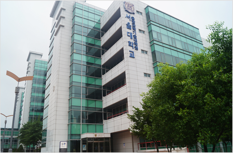
 HOME
HOME